Fever dreams

sowerparkeharrsion.jpg

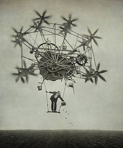
The Sower

Robert Parkeharrison

Have you ever encountered an artist whose work seems so familiar, you feel as if he or she has ensnared your memories? I had that feeling when I first saw Robert Parkeharrison’s The Architect’s Brother. His photographs are like feverish childhood dreams: a Brobdingnagian world in which impossible tasks out of a fairy tale retold by Roald Dahl are documented by the director of La Voyage Dans La Lune.  At least these images resemble my childhood dreams, which typically involved gigantic waterclocks, desolate post-nuclear landscapes, and garbled concatenations of literary references. Mr. Parkeharrison has been rummaging around in my brain! So of course I have to buy this book, and you should too.  The Architect’s Brother traveling collection will next visit the Mary Brogan Museum of Art and Science in Tallahassee, Florida.

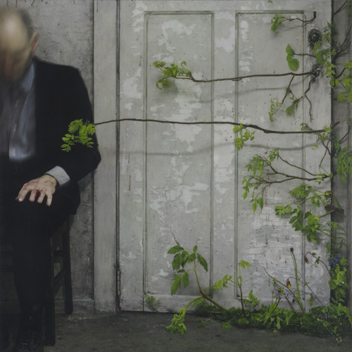
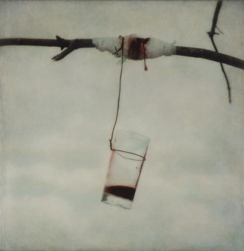
I wish there was also a compilation of the newer work he has completed with his wife, Shana Parkeharrison. Some of this work is visible at the Jack Shainman Gallery. Unlike the Architect’s Brother collection, in which the conflict between madman and injured nature is blunted almost into whimsy, the newer works are starkly ominous. In “Stolen Summer,” butterflies are nailed to a wall, their pigments running down like blood. A bandaged tree bleeds into a glass tumbler. An old man sits oblivious as vines creep under a door towards his legs. These images are also the stuff of fairy tale, but a harsh, fluorescent-lit, urban iteration – less Brothers Grimm, more China Mieville.

rsparkeharrisonundergrowth2006.jpg

Undergrowth

Robert and Shana Parkeharrison, 2006

Jack Shainman Gallery

rsparkeharrisonwound2006.jpg

The Wound

Robert and Shana Parkeharrison , 2006

Jack Shainman Gallery

Posted in Artists & Art, Books, Photography | 3 Comments

Like a rainbow hole in your head

nose.jpg

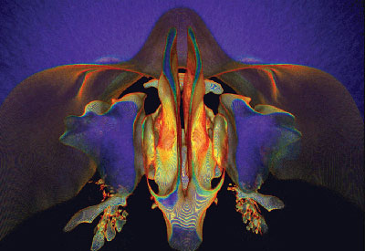
What lies behind our nose?
photography (CT scan rendering)
Kai-hung Fung, 2007

The 2007 Science Visualization Challenge winners have been announced. I love the two (tied) first place winners; although they are both photography, they look like watercolor. Above is Kai-hung Fung’s rainbow rendering of nasal sinuses:

Fung chose to use the patient’s CT images for his rendering, he remembers, because “[she had] a very straight nasal septum and wavy maxillary sinuses; … the anatomy was exceptionally beautiful,” he says.

Normally, CT renderings meld slices together into smooth surfaces, but, in what he terms the “Rainbow Technique,” Fung instead broke them apart, creating a topographical map of the airspaces described by the contour lines of individual slices, and colored according to the density of the tissues that border them.

Fung digitally removed the bones, soft tissue, and fat from the rendering to create a solid “cast” of the sinuses’ air envelope. “The sinuses are hollows in the bone just like the central cavity in a papaya,” he says. One way to get a feel for the shape of such a cavity is to look at a cross section of it, but, he says, it’s much more readily apparent in a mold. (source)

Tied with Fung’s sinuses was an elegant botanical photo, “Irish Moss,” by Andrea Ottesen. The unfurled algae glows against deep black, like a golden mandala.

All the winners, including some remarkable videos, can be seen in this slideshow. The competition was jointly sponsored by the National Science Foundation and Science. Felice Frankel was one of the judges.

Notably, no awards were made in the category of illustration (defined as “Traditional or computer-assisted illustrations and drawings produced to conceptualize the unseen or recreate an object, process or phenomenon (technique). Illustrations and drawings rely primarily on the created image to convey meaning.”)

Also, none of the winners were in traditional media, like watercolor or ink. Does this represent a shift away from using traditional media to depict scientific concepts? I’m really not sure. I hope not. But I do know that traditional media can be a hard sell, both for the added time required to execute a piece, and perhaps because of an implied subjectivity/inaccuracy/”artistic license” when compared with photography. As scientific imaging techniques generate more and more intuitive, even “artistic” results, the need for an artist to reinterpret those results may be diminishing. It’s an interesting question.

Posted in Artists & Art, Biology, Film, Video & Music, Science | 2 Comments

Technology’s ghost

p21-movie_1b.jpg

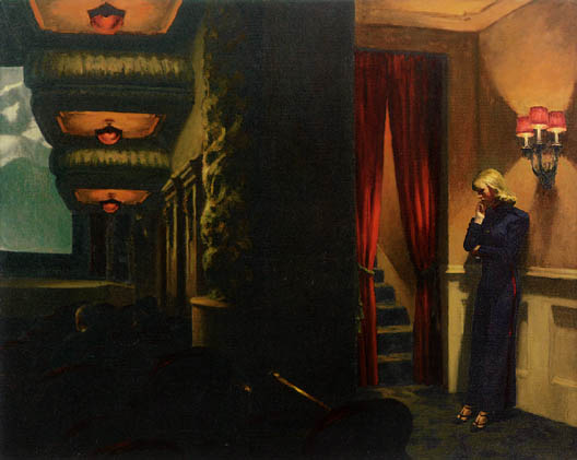
New York Movie
Edward Hopper, 1939
The Museum of Modern Art, New York

I went to the National Gallery’s Hopper exhibit last weekend – it was crowded, hot, and really long. I had no idea so many Hoppers could be concentrated in one space. It was too substantial a retrospective for a single visit – about halfway though, I hit my art appreciation saturation point. Which might be why I saw the luscious red-and-green theatre scene above and immediately thought, Ok, so she’s stepping out to talk on her cell phone.

Ack! Have cell phones gotten that ubiquitous? Has the classic pose of the pensive thinker, head in chin, become merely the crook-necked giveaway of the inappropriately chatty?

I hope I was just tired. Really, really tired.

If you can’t make it to the National Gallery for your surfeit of Hopper, try this excellent Smithsonian website for an overview of his art and context.

Posted in Artists & Art | 1 Comment

Too too solid flesh?

rosine.jpg

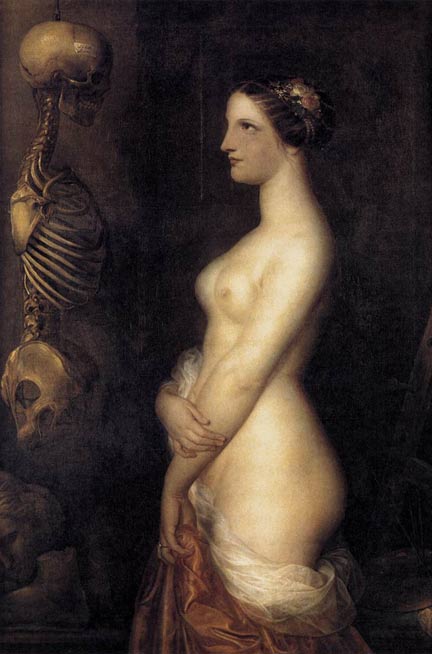
La Belle Rosina (Two Young Girls)

Antoine Wiertz, 1847

Morbid Anatomy has some excellent posts lately – if it’s not on your blogroll already, you should go investigate! I was particularly taken with this painting. I suppose it’s memento mori, and I should be thinking about my own mortality and all. Or – wearing my former-anatomy-professor hat – admiring that nice skeleton. But my first impression was astonishment that the living girl – obviously meant to symbolize blooming health – is so Rubenesque. Scholar Peter Gay calls her “strapping,” and she is – strapping in the healthiest sense of the word. I wish I had as little cellulite as she does! The Belgium-born Wiertz, a somewhat controversial but popular painter in his own time, was clearly influenced by Rubens. Today, most Americans would probably consider Wiertz’s nude overweight – what is she, a 12? Egad!

Bless those Romantics, who would no doubt have found Britney Spears too bony in her recent VMA appearance, and would have fattened her up with some nice mutton and beer. (Or, alternatively, bled her. I didn’t say the last century was all good).

It’s also worth noting that in this picture, “beautiful Rosine” is the skeleton, not the living girl. So says the helpful label pasted to her skull.

Posted in Artists & Art, Museum Lust | 8 Comments

We’re back

Apologies for the downtime. I had a bit of trouble getting it through to my web host that I needed to upgrade my bandwidth!

Thanks for the love, y’all, but you just loved me into a hosting package upgrade – for the second time in a year. Dang!

Posted in Blogs and Blogging, Department of the Drama | 3 Comments

Dustin Yellin

3_image.jpg

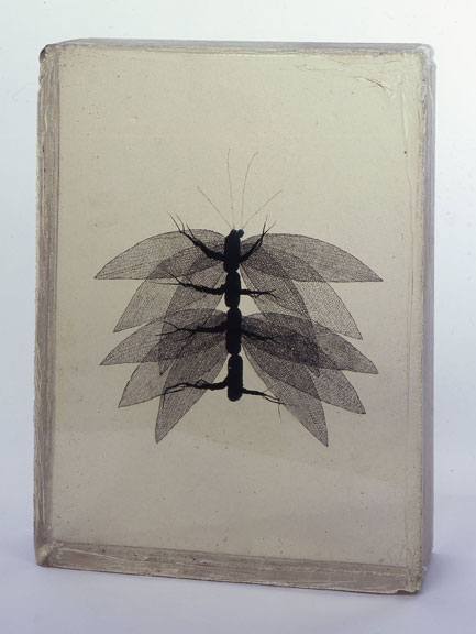
Pecoxus Ferexus
ink and resin
Dustin Yellin , 2006

Resin blocks are commonly used to preserve medical specimens so they can be viewed from all angles without the prgressive fragmentation of a specimen suspended in solution. But in artist Dustin Yellin’s hands, resin is used to deceive: “specimens” such as the one above are not really solid objects, but illusions created using ink. And although the result is convincingly 3D, like a true biological specimen, it can defy classification. Consider the Pecoxus above – is it flora or fauna? Are those skeletonized leaves or the brittle wings of an insect?

According to Culture Catch,

The art of Dustin Yellin is a cross between painting and sculpture, science and science fiction. His magical objects, some taller than the viewer, are comprised of dozens of layers of resin that are meticulously painted with acrylic and inks – layer atop layer – until a sinuous “life form” appears that looks like it would be at home in sea, sand, or air.

Each object is a comment on nature, genetic experimentation, color and form, culminating, in this reviewer’s mind, in some of the freshest and most distinct art being made today. I was reminded, even before I saw the exhibition’s title, of suspended animation because these works are expressions frozen in time. And they have an otherworldly feel, like encapsulated specimens brought back from space exploration, that gives the entire installation a strange viral cast. (source)

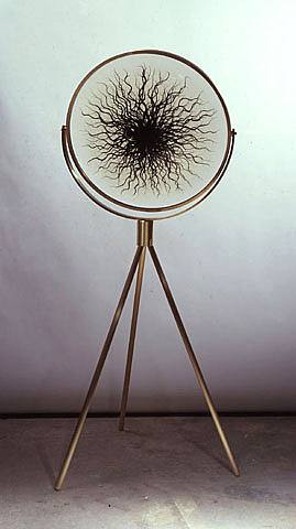
It’s absolutely exhausting imagining the process that must go into Yellin’s work. My favorite is this one, which reminds me of some kind of transdimensional alien overlord from Dr. Who. . .or wait. . . is that the Eye of Sauron?

288218.jpg

Xexus Knotilus
resin and ink
Dustin Yellin, 2007

Thanks to peacay for yet another heads-up on this one!

Posted in Artists & Art, Biology | 2 Comments

Poem of the Week: De Vermis

Fantasy author Robert Jordan died this week, without completing his 12-book Wheel of Time saga. His death is the sort of event I most feared as a lonely teenager, when I lived in books: that an author would die before tying up the loose ends, and their imagined world would be left suspended in ambiguity forever. Imagine if JK Rowling or JRR Tolkien hadn’t been given the time to finish their masterworks. Although I stopped following The Wheel of Time years ago, and almost never read fantasy anymore, I do feel a pang of regret that Jordan never got to see things through. But his wife and cousin say they have sufficient notes to publish the final book of the series according to his wishes.

Whatever you may think of Jordan as an author, as a man he earned the friendship of some remarkable people – among them the brilliant John M. (Mike) Ford, who died last year. I’ve had this poem of Ford’s knocking around in my head for a while, and given his friendship with Jordan, it seems like the right time to post it. I believe it has only appeared online, originally at Patrick Nielsen Hayden’s blog Electrolite. Ford seems to have written it in only a few hours, to meet a hypothetical challenge posed in a post earlier that day. If only we could all toss things like this out in casual conversation. . .

De Vermis
John M. Ford

The worm drives helically through the wood
And does not know the dust left in the bore
Once made the table integral and good;
And suddenly the crystal hits the floor.
Electrons find their paths in subtle ways,
A massless eddy in a trail of smoke;
The names of lovers, light of other days —
Perhaps you will not miss them. That’s the joke.
The universe winds down. That’s how it’s made.
But memory is everything to lose;
Although some of the colors have to fade,
Do not believe you’ll get the chance to choose.
Regret, by definition, comes too late;
Say what you mean. Bear witness. Iterate.

More of John M. Ford’s occasional works (at Making Light)

Posted in Books, Poetry | 3 Comments

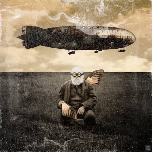
Goggles, Wings and Zeppelins

2007-zepplin-finished.jpg

Zeppelin
Digital
Mikel Robinson, 2007
Candles and Ghosts (blog); Galerie de Illuminata (etsy)

I’ve always loved antique patinas, rusty found objects, and vintage photographs, but these days it seems like EVERYONE has joined the mixed media bandwagon. Suddenly we’re saturated with sepia ancestors, butterfly wings, grungy fonts, and faux-scientific labels. I’m hesitant to work on the mixed media pieces I have on my back burner, because I’m afraid they’ll seem too trendy! My protests that I was doing collage before ephemeramania may sound disingenuous, but I really was. (I also routinely anticipate Pottery Barn trends by a year. And I was never a fan of New Kids on the Block or Milli Vanilli. See? You don’t believe me, do you?)

Although there are hundreds (thousands?) of creative people out there making lovely collages, I rarely find an ephemera artist who makes a strong impression on me with his or her body of work. Mikel Robinson is such an artist. I love his judicious use of illumination, which evokes the primitive technology of advertising lightboxes and magic lanterns, or the gentle fading of souvenirs abandoned under a perpetually sunstruck window. He understands the light-spirited whimsy-wrapped-in-history that is the heart of ephemeral art.

But at the same time, there’s a deeper tension in Robinson’s pieces. Zeppelin, the steampunky image above, is at first glance ridiculous. Check out those coke-bottle goggles! But it’s also a tragic juxtaposition: a humble, self-taught amateur inventor, whose aspirations to flight are embodied in a broken wing and a black machine of war. Sadly funny; damaged, yet stubbornly resourceful – it’s a quintessentially American take on Icarus.
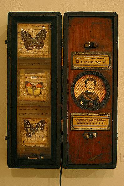
lullaby_b_op_396×594.jpg

Lullaby
Mixed Media
Mikel Robinson, 2003

Although there may be a lot going on under the surface, Robinson keeps his pieces refreshingly simple, resisting the insidious urge to layer and texture an image to death. He lets the artifacts speak for themselves, with minimal (or no) framing: in short, he knows when to stop! In his restraint, Robinson is more closely aligned with the intimate assemblage tradition of Joseph Cornell, than with current trends in altered books or scrapbooking – though the stray butterfly wing here and there does keep his work looking current.

Mikel Robinson’s work is available through his website and through his etsy gallery.

Posted in Artists & Art, Ephemera, Retrotechnology | Comments Off

Darwin for Kids

gbr388.jpg

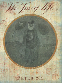
Author and illustrator Peter Sis has written a beautiful book called The Tree of Life: Charles Darwin which follows Darwin’s voyage on the Beagle and re-creates the naturalist’s travel-stained maps and notebooks. The book was released in 2003, and got a gazillion awards, but I haven’t ever seen it in a bookstore. Of course, I’ve also been living in regions where children’s books on evolution are not, uh, the hot gift concept of the season (though such a gift would be a good way to get yourself disinvited from future juvenile birthday festivities).

Anyway, if you happen to need a present for a budding young naturalist, this is ideal. View the gorgeous animated excerpt here and see if you don’t agree!

A MacArthur “genius grant” winner, Sis has written many books, including Starry Messenger: Galileo Galilei, and illustrated still more, such as Jorge Luis Borges’ Book of Imaginary Beings. He has a quiet sense of absurdity, particularly about domestic life. Here’s his explanation of why he switched from pastel to watercolor:

I grew up behind the Iron Curtain. There was a shortage of everything (freedom most of all) — and only one kind of paper, one kind of ink, one kind of paint. I was one happy artist when I became an illustrator in the U.S.A. So many materials! I settled on oil pastels, which I scratched into. That created lots of residue, tiny pieces of paint everywhere. It didn’t matter as long as I was single. It started to matter a bit when I met my wife-to-be and we lived in a loft. It mattered a lot when we had our first baby. It mattered even more when Madeleine began to crawl. We built a wall, but I had nightmares about her getting into my paint thinner and X-Acto blades. I switched to watercolors, but I still wasn’t sure how safe they were. On the other hand, I found out that baby formula dissolves aquarelle. Madeleine loved it. I had to look for a studio outside the house. No more paints at home. I found myself a studio — a little apartment, really — with a kitchen.

I have to fix dinner every day at six p.m. Watercolors dry too slowly, but I can dry them in front of the oven, and bake while I’m drying my pictures. I notice people’s surprise when they meet me in the street carrying a bag smelling like a roast or a chicken. Some of the shapes on my pictures just might be sauce. Now that I have gotten used to watercolors, Madeleine paints at home (with oil). (Peter Sis, “Tiny Pieces of Paint“, in The Horn Book)

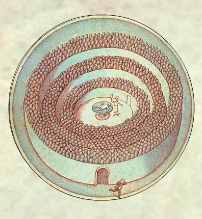
One of the most amusing illustrations in The Tree of Life depicts the young Darwin fleeing a nightmarish theatre of dissection (and, fortuitously, his career in medicine):

darwin1.jpg

Poor Darwin! But what a good thing for biology that he was so squeamish. . .

Posted in Artists & Art, Biology, Books | 2 Comments

Artempo: anatomy and time

nytartempo.jpg
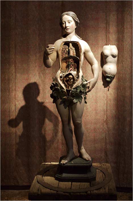
A model of female anatomy by an anonymous artist

Collection of Axel Vervoordt
Photo: David Yoder, NYT

arrempoduant.jpg
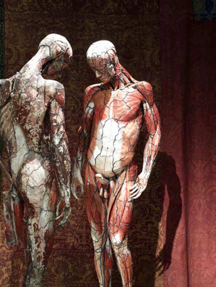
Two anatomic models
Collections of Axel Vervoordt / Museo di Storia Naturale, Donazione Conte Querini Stampalia
Artempo exhibition in Venice, Italy; NYT review and slide show

via bookofjoe and le divan fumoir bohemien

Previously on bioephemera: Wombs, Waxes and Wonder Cabinets

Posted in Artists & Art, Biology, Museum Lust | 1 Comment