If you read my earlier post on anatomical representations of the female reproductive organs, you are familiar with Jan van Rymsdyk’s landmark engravings of a dissected full-term uterus. Thanks to Street Anatomy, an interesting new medical illustration blog, I see that Bulgarian artist Cveotmir Georgiev has created a digital model of a Rymsdyk engraving, using 3D Studio Max, Z Brush, and Photoshop.
Georgiev says (in an interview with Culture3D):
Immediately when I saw Jan van Riemsdyk’s original I imagined it as 3d. Somehow I was reminded of where we come from, where it all starts. I knew that wouldn’t be accepted by everyone, but I did it. The result is evident – public showcase of such work is close to impossible. As much as I tried to steer it from that shallow gross feeling giving it a wax statue look it still is explicit.
Georgiev notes that he tried rendering the piece in gory full color before settling on the sepia tone of his final version. What’s really interesting is to compare the Rymsdyk and Georgiev pieces. Some viewers may find these images disturbing, so I’ve placed them below the fold, as large as possible:
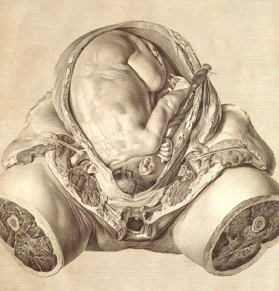
above: Rymsdyk
Anatomy of the Human Gravid Uterus, 1774
(image source: Dream Anatomy)
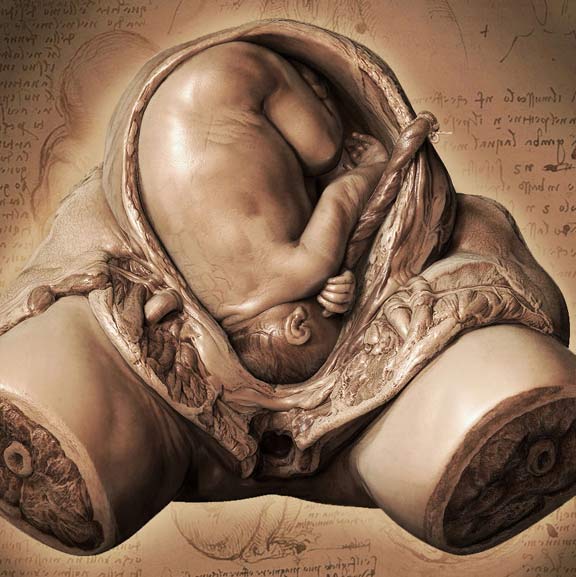
below: Georgiev
Autopsy: Human Embryo, 2006
So what do you think of the update?
I don’t see a huge difference between the two pieces. Rymsdyk’s work successfully represents the textures of the various tissues – the sleek hair of the fetus, the greasy fat of the hypodermis, etc. – in black and white. Although the piece is 2D, he creates an illusion of depth and volume. Georgiev’s version is smoother. The artifacts of the engraving process have been removed, and the greater visual contrast created by the saturated darks gives a tangible heft to the body. It’s very nicely done. Aside from the dignified but mysterious Leonardo-esque background (it looks like his writing, but I don’t recognize the specific notebook page), Georgiev’s piece is a faithful reproduction of Rymsdyk’s.
Here’s what Street Anatomy says about Georgiev’s version:
I feel that the future of medical illustration lies in such dynamic images. These types of medical illustrations will be especially useful for learning anatomy through dissection in anatomy labs. They can be especially valuable to medical students. Photos of dissected cadavers aren’t always very clear and regular illustrations can’t always capture the colors and depth of the anatomy. Medical illustrators often need to look outside of their field for inspiration. Cveotmir’s work is a good example. He is not a medical illustrator and yet he is simply copying these classic medical images and transforming them into something more visually dynamic. He has improved upon the past and created a medical visual more relevant to today’s world.
I admit I’m a little puzzled by that statement. How is the computer modeled piece “more relevant to today’s world” than the original? It’s true that we have grown to expect sleek, polished renderings, and engravings are no longer used. But I think that’s a superficial difference. As for dynamics, if this were a fully rotatable, viewable model, it would indeed be a pedagogical improvement over Rymsdyk’s engraving – because it would be a digital version of the wax models by Clemente Susini!
In terms of the tools used to make it, and the means used to view it, a 3D Max illustration is incontrovertibly modern. But the information conveyed is directly equivalent to the information in Rymsdyk’s 2D engraving or Susini’s wax models. Although there is always room to improve and innovate, I don’t think we give enough credit to these artists of the past for making exceptionally effective use of the tools they had at the time.
3 Responses to Medical illustration: future and past