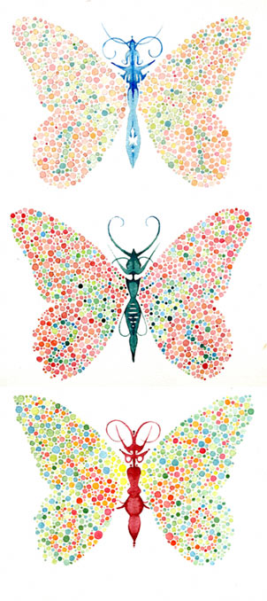
morpho ishihara
watercolor on Winsor & Newton paper, 2007
The Ishihara pseudoisochromatic plate series is still the most common clinical test for colorblindness. Most Ishihara test plates are pointillist circles containing an Arabic numeral, which should be visible (if a little eye-popping) to a normal viewer, but only weakly visible or invisible to a colorblind individual.
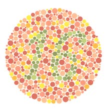
Ishihara plate 12.
Those with normal color vision should read the number 16.
Those with abnormal color vision should not see a number
or read it incorrectly.
So what do butterflies have to do with Ishihara plates? Complex butterfly wing patterns, like Ishihara numbers or traditional television screens, are an illusion created by many small units of primary colors. When we interpret the dots as gradients, shapes and complex patterns, we use both color information and light/dark information about each dot. For colorblind individuals, the light/dark information is (mostly) normal, but the color information is off, and they have difficulty resolving a shape based on color alone.
The three general types of color vision deficiency are protanopia, deuteronopia, and tritanopia. In each condition, one of the three retinal systems that distinguishes the three primary colors of light (red, green, or blue) is compromised. Tritanopia affects blue cones and is quite rare. Protanopia and deuteronopia affect the cones that process red or green light, and are usually both called “red-green” colorblindness. Protanopes and deuteronopes still see red and green – they don’t find apples or tomatoes invisible, or black-and-white – but they can’t tell the difference between red and green. Instead, red and green shades (along with orange and yellow) appear as the same muddy ochre color. There is also a fourth, very rare type of colorblindness – total colorblindness, or monochromacy, in which all cones are missing (achromatopsia) or only one type of color cone is present. These individuals do not see “color” as we understand it at all.Most “colorblind” individuals are not complete protanopes or complete deuteranopes. They may have only a partial deficiency (protanomalia or deuteranomalia), and may not even be aware of it. The first paper on colorblindness was written in 1794 by a red-green colorblind scientist, Dalton (yes, the atomic theory dude). He compared objects of different colors and found that his observations differed radically from his colleagues’:
that part of the image which others call red appears to me little more than a shade or defect of light. After that the orange, yellow and green seem one colour which descends pretty uniformly from an intense to a rare yellow, making what I should call different shades of yellow.
Red-green colorblindness has been generally called Daltonism in his honor, but there was some question about the specific form Dalton had. In 1995, Dalton was finally proven to have deuteronopia – by DNA testing of his preserved eyeball. Eeuw! (Dalton himself had suggested it be saved for further study – now there’s a scientist for you).
The overwhelming majority of red-green colorblind individuals are men, because the genes for both red and green cone pigments are on the X chromosome. Thus, men inherit colorblindness from their mothers, who usually have normal color vision. Women can indeed be red-green colorblind, but they would have to be unlucky twice over, inheriting a defective allele on the X chromosome from both mother and father.
Although this painting was inspired by Ishihara’s plates, be aware it is not a valid clinical test for colorblindness. It’s a response to the aesthetics of the Ishihara test. But I was interested to see if the numbers would be visible to colorblind persons. Digital algorithms can approximate the different forms of colorblindness by altering the different channels of a digital image file. According to one such simulation, butterfly 1 should be quite difficult for a complete protanope or deuteronope, butterfly 2 less so, and butterfly 3 easiest of all – but harder for a protanope than a deuteronope. Tritanopes should be able to see all three numbers, as could a person with only partial red-green colorblindness. If you are colorblind, let me know what you see!
At least 1 in 12 individuals has a red-green color vision deficiency. Most artwork, websites, and advertisements will appear very differently to these colorblind individuals. Yet it is extremely difficult for an artist or designer with normal vision to anticipate how a colorblind person would see their work. It’s not as simple as rendering the artwork in greyscale, like a black-and-white TV, because the typical colorblind individual, with partial red-green colorblindness, does see an altered color spectrum. If you are not colorblind yourself, consider checking your web page to be sure it’s legible to colorblind individuals. Technically, my blog is non-optimal for colorblind individuals, because I use red on black for links, and red can appear almost black to protonopes. But I’ve tweaked the red to make it orange enough that it should be legible. (If not, post a comment and let me know!)
Because each color pigment gene comes in several different versions (or alleles) and many of us have extra copies of the green pigment gene, even people with “normal” color vision may have slightly different combinations of functional retinal pigments, which could translate into seeing “red” or “green” or “blue” most strongly at slightly different wavelengths. If you’ve ever argued over whether a paint chip is “greeny blue” or “bluish green,” whether grape juice is purple or merely dark red, or whether a fallen leaf is light orange or dark yellow, you know that we don’t all categorize, or even see, colors identically. Working with Ishihara-style patterns stretched my ability to envision the dichromatic palette, but I still can’t imagine what the world is like for a complete deuteranope. Traffic lights, all the varieties of apples, strawberries, fall leaves, roses, red and green peppers, stop signs, blood: color vision is a gift.
7 Responses to morpho ishihara