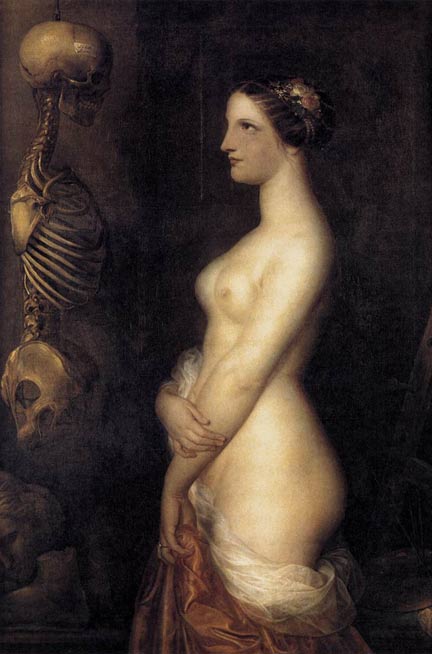
La Belle Rosina (Two Young Girls)
Antoine Wiertz, 1847
Morbid Anatomy has some excellent posts lately – if it’s not on your blogroll already, you should go investigate! I was particularly taken with this painting. I suppose it’s memento mori, and I should be thinking about my own mortality and all. Or – wearing my former-anatomy-professor hat – admiring that nice skeleton. But my first impression was astonishment that the living girl – obviously meant to symbolize blooming health – is so Rubenesque. Scholar Peter Gay calls her “strapping,” and she is – strapping in the healthiest sense of the word. I wish I had as little cellulite as she does! The Belgium-born Wiertz, a somewhat controversial but popular painter in his own time, was clearly influenced by Rubens. Today, most Americans would probably consider Wiertz’s nude overweight – what is she, a 12? Egad!
Bless those Romantics, who would no doubt have found Britney Spears too bony in her recent VMA appearance, and would have fattened her up with some nice mutton and beer. (Or, alternatively, bled her. I didn’t say the last century was all good).
It’s also worth noting that in this picture, “beautiful Rosine” is the skeleton, not the living girl. So says the helpful label pasted to her skull.


Hmm, maybe they smoothed over her cellulite. Or maybe cellulite didn’t EXIST back then. Lucky girl!
By the way, I hope you don’t mind if I recommend your site to some of my historic-medicine-loving friends?
Ah, the golden age before cellulite. What a time.
Please do recommend the blog – I’m glad you like it. Also, I popped by your journal and have to comment on this wierd coincidence – I just got off food poisoning a few days ago, and I never get it either! So perhaps great stomachs. . . uh. . . churn alike. Actually, never mind . . .
Hello! Oh dear, poor you with your food poisoning too! Uh oh, well at least our misery had good company… or something.
A lot of my blog friends are fans of the Master and Commander books, as am I, and we’ve been discussing amputations for battle wounds and the like in the early 19th century, which is how your name came up in my thoughts. I’ve been showing them lovely gory historic illustrations. The doctor, of course, is my favorite. Have you read any of the books, or seen the movie?
I’m ashamed to say I haven’t, but I hear wonderful things about it. The movie is definitely on my rental list. Although I hope it’s not too gory – I find amputations a lot less objectionable in medical illustrations than re-enacted!
Haha, actually every time I watch the movie, I’m disappointed that there’s not more gore, in length and visuals. I want to SEE what’s going on! (There are several different surgical scenes.) Did you see in my blog that I’m making a dollhouse miniature version of an early 19th c. sickbay and dispensary? I made little trephines and bone saws even!
So, are you a medical illustrator by profession, or studying to become one? Or something else? And do you have a name? I’m Grace – not surprisingly. Hello! I’m an art conservator. I thought briefly about becoming a medical illustrator, but conservation suits my talents much better. Still, I’m a bit wistful about your world…
Hey Cicada — Interesting blog. You inspired me to blog back at you about it.
http://thewitlesswanderer.blogspot.com/2007/09/beauty.html
I agree about Morbid Anatomy, it’s facinating.
Pingback: Il ReteGiornale - la Tua Voce in Rete» Cultura » L’Art prend le metro - Paul Delvaux
Pingback: Il ReteGiornale - la Tua Voce in Rete» Cultura » L’Art prend le metro - Le fantasie scientifiche di Paul Delvaux