
Mixing Memory : Does Red Weigh More Than Blue?
Here is an outstanding summary of research into the effect of color on the apparent weight of objects. Brighter colors like pink consistently have less visual “heft” than darker ones like red. However, no one appears to be doing any recent research into why this is.
This is a perceptual effect you’re probably most aware of in the supermarket. Food manufacturers nearly always package their diet foods in brighter, less saturated colors, which appear “lighter” next to the darker-packaged reference foods. They’ve been doing this for years, as seen with these cans of Pepsi:


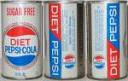


With Pepsi Light, and other diet foods, the use of the adjective “light” to indicate low-calorie is a little bit dicey. The mass of the food item itself is not in question – a can of Pepsi Light weighed the same as a can of Pepsi. It’s the mass of the consumer that’s the issue, and apparently that tenuous link is enough to make consumers prefer “lighter” foods (even if they then eat excessive amounts of them).
In Canada, foods marketed as “light” must have reduced fat or calories, but in the US you can still get away with using “light” to describe food attributes like taste, color or texture. And no one seems to care what color the food packaging is. . .