Was the Black Death > Spanish flu?

Pop quiz: which plague took more lives – the Black Death, measles, or Spanish flu? Find out in a surprisingly eye-pleasing way with this infographic from Column Five Media and GOOD (snippet below):

I’m a little creeped out that an infographic about massive casualties looks kinda like a pretty Anthropologie floral apron, but hey, that’s aesthetics.

Posted in Data Visualization, Design, Medical Illustration and History | Comments Off

Remarkable Lego street art illusion

Legophemera FTW. If you have not yet seen this street art illusion of a Lego terra cotta army, watch now – before your techie-artsy-hipster cred is permanently diminished!

Video: “Lego Army,” by Leon Keer at the Sarasota Chalk Festival 2011.

(Relatedly, I wrote a post about anamorphic illusions at Scienceblogs a couple of years ago.)

Posted in Artists & Art, Ephemera, Events, Film, Video & Music, Frivolity | Comments Off

“Jesus is God’s Atomic Bomb,” and other lyrical classics

Conelrad’s fascinating cold war culture jukebox, Atomic Platters, offers lyrics and historical context spanning several decades of popular atomic-themed music. Many of the songs unsurprisingly convey a sense of unprecedented, un-romanticized astonishment and awe. Consider the following gem:
Continue reading

Posted in Education, Ephemera, Film, Video & Music, History of Science, Science in culture & policy, Yikes! | Comments Off

“Where I live, everything is so small!”

APOD’s photo of the day is, in the words of my boyfriend, “very The Little Prince.” How wonderfully whimsical.

Posted in Littademia, Photography | Comments Off

Russian water computers + garden design = underused steampunk plot

If you’ve been secretly hankering to read an Umberto Eco novel about the Illuminati building a giant proto-computer underneath Versailles, do I have the blog post for you!

Posted in Blogs and Blogging, Ephemera, Frivolity, Retrotechnology | Comments Off

taking choices back from technology: David Imus’ old-fashioned new map

Slate recently had a story by Seth Stevenson on Oregon mapmaker David Imus, who spent thousands of hours painstakingly crafting a two-dimensional wall map of the US. While yet another schoolroom wall map might sound like a complete nonstory, Imus’ Essential Geography of the United States is, in some eyes, a work of art. Imus didn’t use the automated software commonly used in mapmaking. Instead, he selected, sized, colored and tweaked everything himself, eyeballing details like a monk illustrating an illuminated manuscript. The result is a map that was so grossly inefficient to produce, it’s unique in modern society:

Anybody can download databases of highways, airports, and cities, and then slap a crude map together with the aid of a plotter. What separates a great map from a terrible one is choosing which data to use and how best to present it. . .

. . . the big mapmaking corporations of the world employ type-positioning software, placing their map labels (names of cities, rivers, etc.) according to an algorithm. For example, preferred placement for city labels is generally to the upper right of the dot that indicates location. But if this spot is already occupied—by the label for a river, say, or by a state boundary line—the city label might be shifted over a few millimeters. Sometimes a town might get deleted entirely in favor of a highway shield or a time zone marker. The result is a rough draft of label placement, still in need of human refinement. Post-computer editing decisions are frequently outsourced—sometimes to India, where teams of cheap workers will hunt for obvious errors and messy label overlaps. The overall goal is often a quick and dirty turnaround, with cost and speed trumping excellence and elegance.

By contrast, David Imus worked alone on his map seven days a week for two full years. Nearly 6,000 hours in total. It would be prohibitively expensive just to outsource that much work. But Imus—a 35-year veteran of cartography who’s designed every kind of map for every kind of client—did it all by himself. He used a computer (not a pencil and paper), but absolutely nothing was left to computer-assisted happenstance. (source)

As a result, Imus has received a flood of praise. His website boasts endorsements like “I have seen Imus at work. He is both scientist and artist, raising the art of map making to an all-new level.” (Bob Welch, Eugene, Ore. Register-Guard) or “Like a beautifully illustrated manuscript, the map engages both sides of the human brain.” (writer Barry Lopez). I have no idea who Bob and Barry are (nor do I know David Imus) but those are the sort of soundbites that get BioE’s attention. They’re also the sorts of things you often hear about good data visualization and informational design, which elicits a little skepticism, but in this case the Cartography and Geographic Information Society gave Imus their “Best in Show” award. In other words, his work resonates with the general public, but also within the community of technically skilled mapmakers. As Seth Stevenson wrote in Slate,

Other mapmakers I spoke with marveled at the handcrafted beauty of the thing. (One guy reminisced about a Soviet map from the 1970s that used different colors for freshwater and saltwater lakes. He said Imus’ map achieves that level of specificity.) This is an example of heartfelt, artisanal cartography coming from a pro at the top of his game.

While the differences between Imus’ map (snapshot at the top of the post) and those familiar schoolroom National Geographic maps may seem too subtle for the inexperienced eye, Imus is betting we will be affected by those differences, and that they’ll improve the flow of information from map to mind. He’s made a pdf devoted to the educational goals of the project – goals like getting a 2D map to elicit a more intuitive appreciation of the US’ varied topography, or manipulating the density of town names to convey a better sense of population density in different regions.

But even if the educational benefit were marginal, the map has a certain artisanal cred that’s increasingly scarce. An era of pervasive technology has sparked new appreciation for the old-fashioned techniques of letterpress, letter-writing, calligraphy, photography, etc. – even handwritten letters seem unusual today. And while we all use technology to assist us, we appreciate work in which the artist/designer has taken interstitial default choices back from the machine. That’s increasingly hard to do, especially with mass-market tools. As you probably have experienced, Microsoft Word automatically formats and “corrects” your document willy-nilly, as if it knows better than you do what you are trying to say; I always turn its more paternalistic functions off. But there are some standardized technologies to which I capitulate, allowing my work to conform to the technology and its defaults, instead of vice versa (like when I used to size paintings just small enough to fit on my flatbed scanner!). We may not pay attention to how we let our tools make certain choices for us, but we do let them make those choices – and Imus’ work is an example of the difference it makes when you take those choices back.


Posted in Design, Education, Maps, Retrotechnology, Web 2.0, New Media, and Gadgets | Comments Off

Sciart Links

I’ve been too busy to write a real post lately, but that doesn’t mean there aren’t some amazing sciart/ephemera-art links going around. Here are some:

Origami human torso with organs (via David Ng)

In situ pencil lead carvings – the best way you never thought of to keep yourself busy during a boring class (via Miles Cannon)

Surprisingly accurate turn-of-the-century space landscapes (iO9)

Mountains and rivers of the world, 1823 (Retronaut)

And a snarky look at how Sumerians had intellectual property all figured out (also via Miles):

The main way Sumerians protected the integrity of their data was through curses. This may seem laughable to a modern audience, but I don’t think we’re so different. Does you expect the FBI to actually raid your house if you copy that VHS tape?

Posted in Artists & Art, Blogs and Blogging, Ephemera, History of Science, Medical Illustration and History | Comments Off

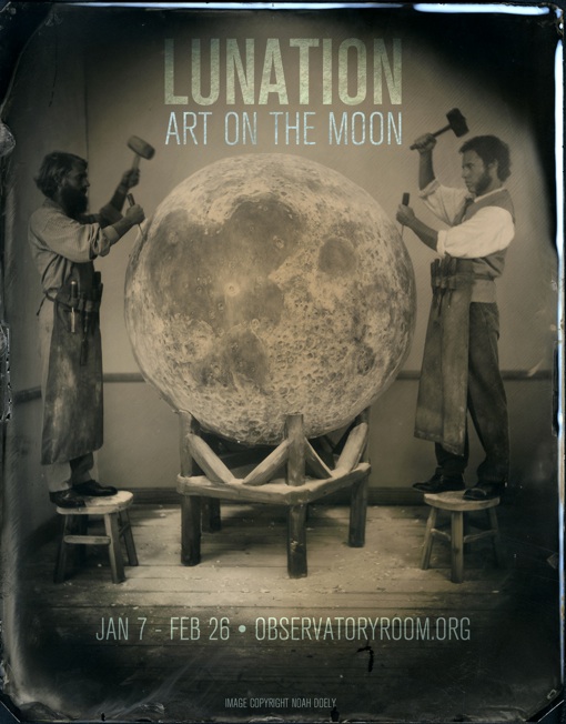
Art on the Moon?

Lunation, a group-curated show, opens today at Brooklyn’s Observatory:

Artists and scientists have always been attracted to the moon. . . Our closest celestial neighbor, the earth’s little sister, the moon creates the tides and illuminates the woods at night. For centuries, humanity believed the moon provided a key into the invisible realm: it called out the beast within us, freeing us to act as wolves, to run, to dance, to chant—and sometimes (as in Duncan Jones’ Moon) to split in two, to find our double, our changeling moon-self.

Is the moon home to life? Today we know it isn’t, but even as of 1830, speculation was rampant that the moon was inhabited by Christianized bat-people who worshiped in great ziggurats. (See The Sun and the Moon by Observatory alumnus Matthew Goodman for details.) Still, life comes to the moon. We know the moon contains frozen water, and we dream of using it as our jumping-off point for visiting even more alien vistas. . .

I’ve read the Sun and the Moon, and it’s a great book; any show that draws inspiration from it is one I’d like to see. And how great is the exhibition poster?

Reception, 7pm Saturday January 7, at Observatory.

Posted in Artists & Art, Events, History of Science | Comments Off

Chipotle saves spherical pigs from Science

If one of your New Years’ resolutions is to eat healthier, more sustainable food, contemplating the evils of industrial food production and re-reading The Omnivore’s Dilemma might help you reach that goal — and you might want to post this short film (commissioned by Chipotle) to Facebook:

Although I like the short very much, I’m also a little sad at the way Coldplay’s “The Scientist” has become shorthand for post-industrial regret. Science does not have to equate with cold, sterile industrialization, or with exploitative factory CAFOs. As my boyfriend pointed out, the film could be set to the Dandy Warhols’ upbeat “I am a Scientist” and end with the farmer not simply razing his bleak industrial farmscape, but rather transforming it into a funky steampunk green energy solar windmill complex, freeing him from dependence on the petroleum-powered grid while he flies around his farm in a custom dirigible inflated and powered by agricultural waste.

Alas, it was not to be.

Regardless, I have to admit Coldplay’s lyrics (which aren’t really about science anyway) work well here, and the animation is adorable. Nice work, Johnny Kelly (and Willie Nelson). A look behind the scenes reveals that it’s actually stop-motion animation, not digital – which means many adorable pig models, including extra-tiny pigs for the distant hills. Awww.

Posted in Biology, Conspicuous consumption, Ephemera, Film, Video & Music, Science in culture & policy | Comments Off

Carnival of the Animals: holiday window wonder cabinets

Bergdorf Goodman’s elaborate animal-themed holiday window displays rock my world:

See more windows (huge images) at their blog. The last window in particular is Snow Queen-esque (think Narnia); the metal bird themed window seems very Yeatsian. Truly, upscale holiday window displays have become our modern wonder cabinets. . .

Via my friend Sylvia; photograph by Ricky Zehavi from the BG blog. You can see more of BG’s window details on their Google+ profile, if you can’t stop by in person.

Posted in Artists & Art, Conspicuous consumption, Design, Ephemera, Frivolity, Wonder Cabinets | Comments Off