Cognitive Daily: Artists look different
Cognitive Daily alerts us to a study quantifying the different visual scanning techniques used by artists and non-artists. Here’s a figure from the study, tracking eye movements in yellow:
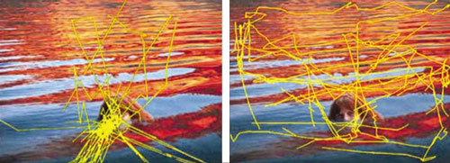
The trained artist (right) looks at more of the entire picture, while the non-artist (left) focuses on “key areas” – in this case, the swimmer, but similar results were obtained for non-human “key areas”. (The non-artist control group were psychologists – also highly trained to study and retain information).
If you have artistic training (including self-guided training), you may have noticed this shift in your own observational techniques. An artist considers the scene as a whole: focusing on the subject in relationship to its context, rather than in isolation. I especially appreciate the way the artist’s eyes follow the rhythm of the waves diagonally across the painting – identifying and enacting an important compositional pattern that the non-artist appears to completely ignore.
The jerky, flyaway eye movements of the nonartists, which seem to repeatedly slide right off the image, are not a surprise either. Artists plan for those effects when composing a work, carefully guiding the imagined viewer’s eyes within the painting’s field. A standard rule of thumb is to avoid a strong, unbalanced line, or any object ending right at the border of the composition, because they tend to draw the onlooker’s eye irrevocably off the edge of the artwork (sort of like a ship falling off a flat Earth).
In my experience, beginning artists, like this non-artist, tend to concentrate on the subject to the exclusion of everything else – leaving the setting out completely, neglecting to identify a light source, and focusing disproportionately on points of special interest, especially faces and eyes. This behavior makes perfect sense when you’re processing an image as efficiently as possible – you extract, categorize, and identify the most relevant objects in the scene, ignoring the irrelevant lighting and background. An apple remains red in bright sunlight, shadow, even colored light (color constancy). The ability to consistently recognize an object in both light and dark conditions, from different angles, is absolutely essential to survival; the ability to paint a convincingly realistic scene, not so much! At least not unless you’re an artist, and that’s your job.
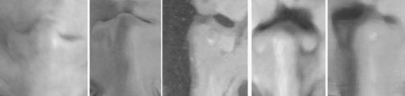
Unfortunately, common errors in art result from excessive intepretation, and relying too weakly on what is directly observed. This is the basis for the “draw what you see” principle, and the human face is the best example. We all know exactly what a human face looks like, and (except for the occasional prosopagnostic among us) we each recognize hundreds or thousands of faces with great accuracy. But it’s almost impossible for the average person to draw a realistic human face. It’s not just a matter of manual dexterity: Cohen and Bennett (1997) showed that misperception of the object was a greater source of drawing error than decision-making, motor skills, or misperception of the drawing. It’s a matter of the brain interfering, telling you what a “nose” should look like, when in fact, a nose usually looks nothing like a “nose.” If you look at the noses in oil portraits from the collection of the National Portrait Gallery, they are highly variable collections of blotches. And yet they all look like noses:

All of these examples are obviously noses, despite their varied shapes and lighting. Note how each example also readily appears to be human skin, despite some very unrealistic tones (mostly the effect of no-flash bad photography). To make it a little clearer how different each rendering is from the next, I’ve flipped them upside down, and removed the distracting color information:
I think it’s remarkable that we can identify each example as a nose, even in isolation from other cues like eyes or mouth. But in order to draw a nose, we have to stifle the powerful recognition process that screams “it’s a nose!” – and instead render contours and volumes. That’s not so easy. Of course, in this study the artists were not asked to actually execute a drawing – see this article for an interesting discussion of eye movements during the process of portrait drawing.
Even if the results of the eye-tracking study are not surprising, this is the first time I’ve seen them depicted so clearly. This sort of example could be quite helpful when teaching drawing – if you know why common errors of perception occur, you have an even better chance of learning to compensate.
4 Responses to Looking to Remember